Type Design
Hand-drawn type is a passion project of mine. It allows me to focus on the shape of the letters and the form of the word—adding a whole new light to the type itself.
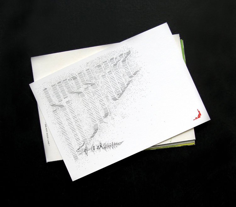
HIGHLINE POSTCARDS: Invited to design a postcard to celebrate the construction of the Highline. Inspired by the train tracks, the three-dimension pencil sketch formed the visualization of the rail and the word.
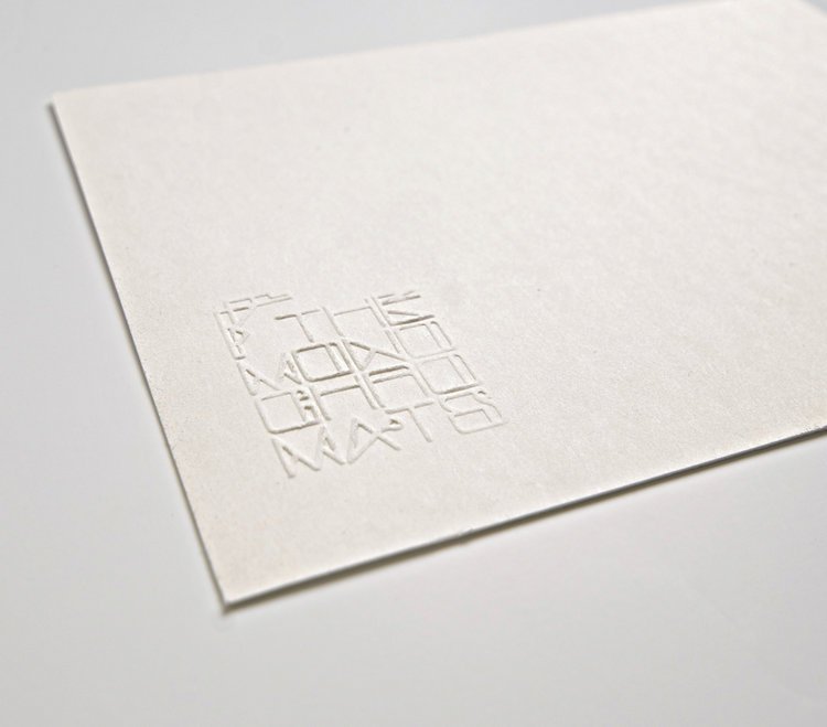
THE MONOCHROMATS: I have drawn this alphabet to play on the 2D nature of a three-dimensional type (as if it's curled and sculpted from a stripe of paper). From there, various iterations were formed - filled, outlined, etc.
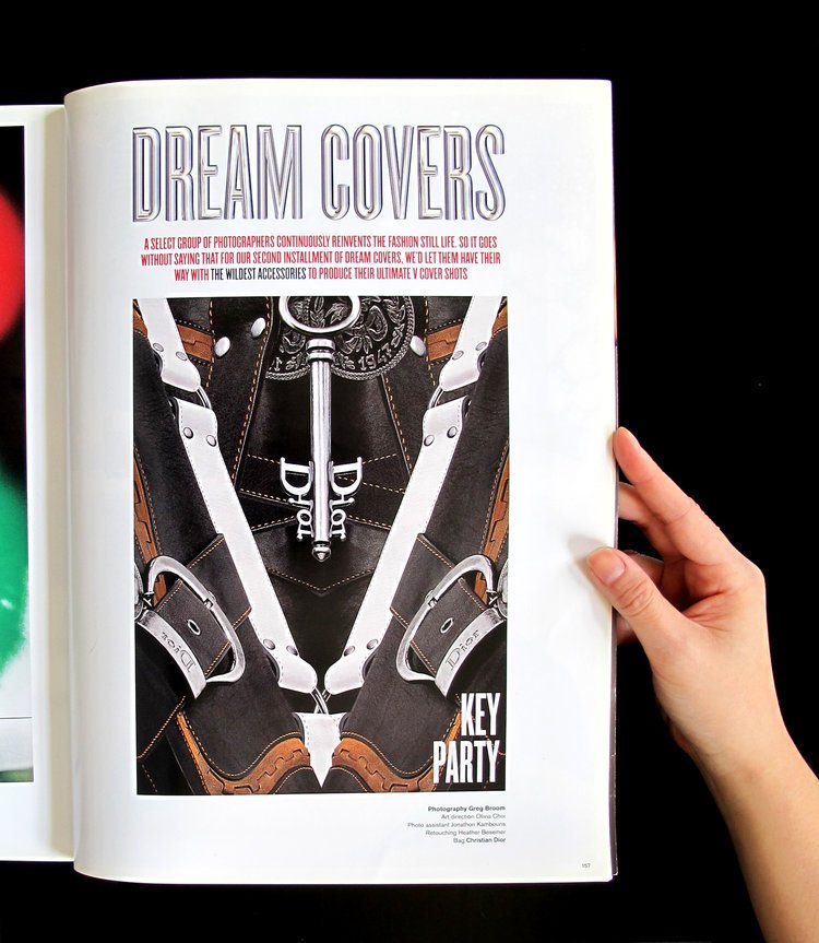
V-MAGAZINE / DREAM COVERS: Invited to contribute a design for what my version of V Magazine cover would look like. I took the photograph of a Dior bag and deconstructed part of the bag and form the V symbol.
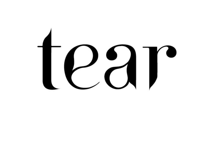
TEAR TYPEFACE: An original serif typeface design inspired by the shape of a tear.
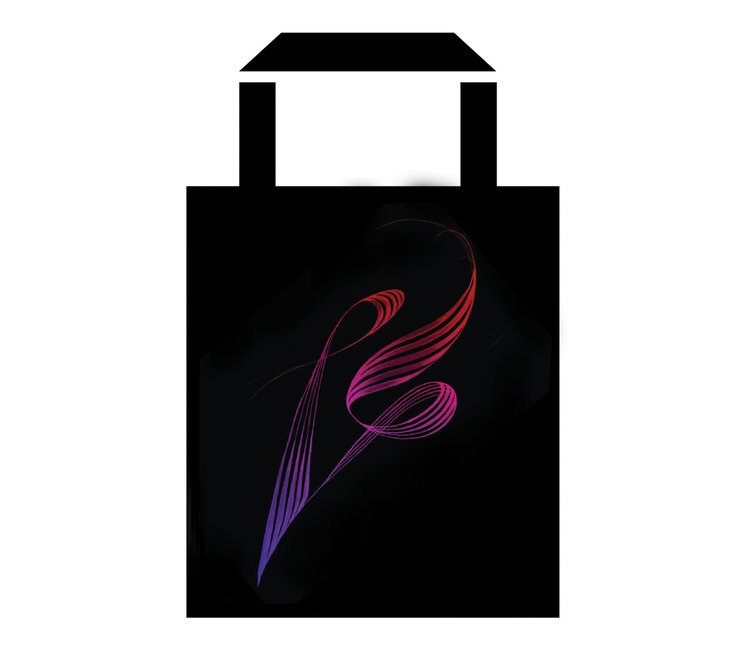
PAPER MAGAZINE / CARRY HOPE TOTE BAG: Invited to donate a tote bag design for Paper Magazine's charity event Carry Hope. The design was contributed to an organization called Mr. Holland's Opus, which donates new and refurbished instruments to schools in need. The core of the concept are the letters F and Y, which stand for "forever young". The five lines represent sheet music where each note of a new story is laid down. The fluid motion signifies the progression of music - organic and expressive, emotional and dimensional.